For the Holiday season, Cheetos created a chic fashion line that consisted of an array mischievous gifts to give away to family and friends. The website design brings a stylish and classy look to the normally playful and whimsical.
Awards: Gold & Bronze Reggie Awards
Role: Jr. Art Director
European Wax Center is the largest and fastest-growing franchisor and operator of out-of-home waxing services in the United States providing guests with an unparalleled, professional personal care experience administered by highly trained wax specialists within the privacy of clean, individual waxing suites.
As an in-house designer, I’ve had the privilege of reimagining and creating designs for our website homepage, emails, packaging & store-front barricades for new centers.
Role: Sr. Graphic Designer & Product Photographer
Exclusive. Discerning. Affluent. The Allergy Buyer Club customer comes to us to find a carefully cultivated selection of the very best home health goods. They’re accustomed to the highest level of quality and service money can buy.
Inspiration for this look and feel is derived from the country clubs, yachts and luxury cars our customers are well-acquainted with. We selected a color palette that conveys a feeling of elegance with darker natural tones, lifted by the splashes of blue. The logo is meant to be reminiscent of the brand marks you may find at your favorite club, to encompass the professionalism and crisp feel of their facilities.
Role: Art Director & Designer
As the new website for The Pure Company began to launch, we needed to update our social media in its new look and feel. We were tasked with creating social posts and photographing products to further promote its natural & elegant lifestyle.
Art Direction & Photography: Corinza Harper & Wolfgang Floresca
As the need for additional photos for our new products rose, I was tasked with capturing elegant shots to send to partnered agencies for paid social, product pages & in-store signage nationwide.
Role: Art Director & Photographer
Beaver's Coffee + Donuts is a Chicago based food truck that is best known for its mini donuts and donut milkshakes. The design of the logo combines their unique product with the beaver's affinity for wood. The system plays off the diagonal bite and the two main products their company sells.
As a reboot of Cheeto's successful summer program in 2015, Cheetos Museum 2.0 brought back the ability for consumers to submit their unique Cheetos for their share of 50K. The logo and packaging combine the modern structure of a museum with a whimsical Cheeto's flair.
Awards: 2018 Gold Cannes Lions award in the “Creative Effectiveness Category”
Role: Jr. Art Director
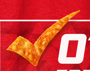
During the 2016 election season, Doritos launched their Red vs. Blue campaign which pitted their most popular flavors, nacho cheese and cool ranch, against each other. Consumers voted for their favorite flavor and the contestants that entered codes from specially marked packages received prizes. Nacho cheese garnered the most votes and the consumers received the shown merchandise.
Role: Jr. Art Director
The package shown functions both as a package for balloons and a funnel to fill your balloons with various kinds of decorations for all occasions.
A collection of various logos I’ve designed over the years.
A collection of various posters I’ve designed over the years.